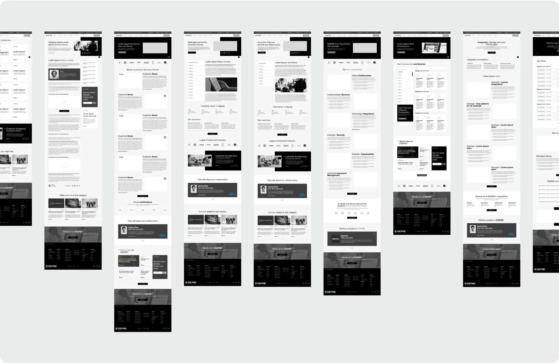
Egerie
Egerie is a software company specialized in cyber security analysis, simulation, and management. Our goal is to modernise the face of the organization website's design and internal architecture to reach a broader international audience.
Following a successful fundraising, Egerie sought to elevate its digital presence with a more product-focused and globally appealing website. With ambitions to expand their brand internationally, Egerie felt the need for a modern, user-centered platform that effectively communicates their innovative cybersecurity solutions. The redesign aimed to transform the website into a powerful tool for showcasing products and services, ensuring it resonates with a diverse global audience while maintaining the company's evolving brand identity.
To gain a deeper understanding of our target users and their needs, we collaborated with representatives from various departments within Egerie. Together, we identified and created three key personas: Client, Partner, and Prospect. These archetypes encapsulate the diverse user base we aim to serve.
For each persona, we meticulously mapped out their journey on the current version of the website. This exercise was instrumental in pinpointing friction points that users encounter. By visualizing these journeys, we were able to collectively brainstorm and devise potential solutions tailored to each user type, enhancing their overall experience.
Leveraging insights from our persona research, we drafted an initial organization of the website's content. This preliminary site map was then refined through discussions with various Egerie departments, ensuring their requirements were met while adhering to the client's constraints on the website.
With Egery's brandline undergoing a makeover alongside the website, we seized the opportunity to meticulously develop greyscale wireframes. This approach allowed us to concentrate on scale and information hierarchy, ensuring the design was both intuitive and user-friendly from the outset.
By focusing on structure and functionality first, we set a solid foundation for integrating the evolving brand identity seamlessly into the final design.
Once we got a comprehensive understanding of user needs, site structure, hierarchy and the new brandline we embarked on designing the website. To ensure consistency and coherence, we adopted a modular approach, inspired by Brad Frost's atomic design methodology. This involved categorizing our components into four hierarchical levels: Design Tokens, Atoms, Molecules, and Organisms.
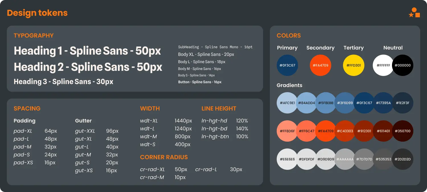
Design tokens represent the fundamental rules and properties at the subatomic level, forming the foundation of our design system components. Although the brand work was handled by a different team, we seamlessly integrated their guidelines into our system to ensure brand consistency.
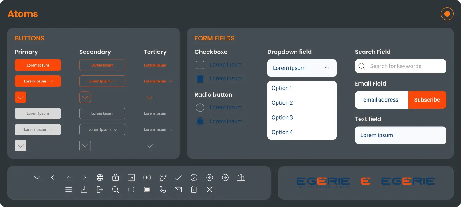
With our design rules established, we created the atomic elements of the design system. These graphical elements serve as the basic building blocks, essential for constructing all design components. Atoms are the simplest, indivisible elements within the system.
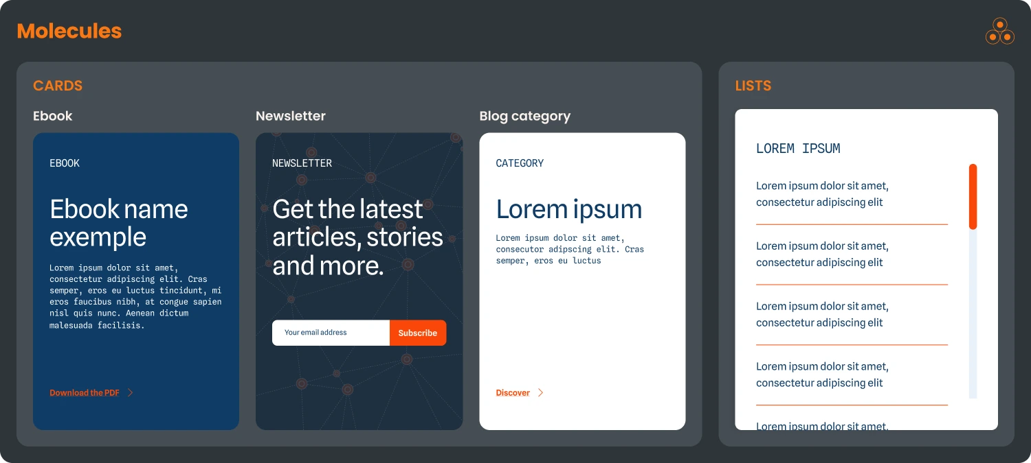
By combining atoms, we added context and functionality, resulting in the creation of molecules. These components represent a higher level of the design system, providing essential functions within the graphical ecosystem.
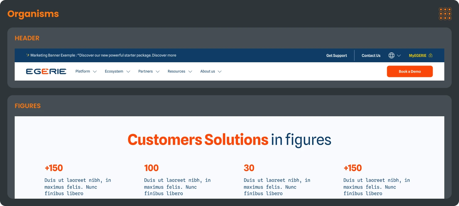
Organisms are the most complex elements within the design system, composed of multiple atoms and molecules. These section-level components perform specific tasks and are designed for reusability across the entire website, ensuring a cohesive and functional design.
Through user research and ideation workshops, we restructured Egerie's website to be more product-focused and user-centric. The development of a cohesive design system ensures consistency across the platform while providing the flexibility needed for future iterations. This foundation not only enhances the current user experience but also sets the stage for seamless growth and evolution.