Turning the purchase process into a simpler experience

Frichti

UX/UI User Testing Prototyping

Frichti is a French food delivery service with eco-friendly ethos including : quality products, minimal food waste, biodegradable packaging, and electric scooters for all deliveries. Our goal is to overhaul Frichti's app to decrease the users' drop-out rate before the purchase.

Overview

Frichti had encountered a recuring problem : a lot of users were abandoning their carts before checkout. That was a big deal for the food delivery service as each drop-off was a missed opportunity. Their goal was to make the checkout process simpler and smoother. Our role was to rethink this key moment in the user journey, making it not just efficient but also more intuitive and engaging.

User Research

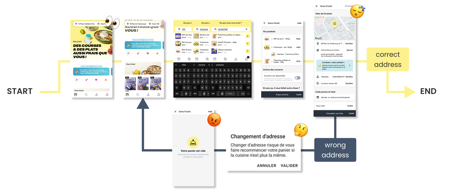
To pinpoint the issues in Frichti's checkout process, we ran user tests with a diverse panel, some familiar with the app, others using it for the first time.

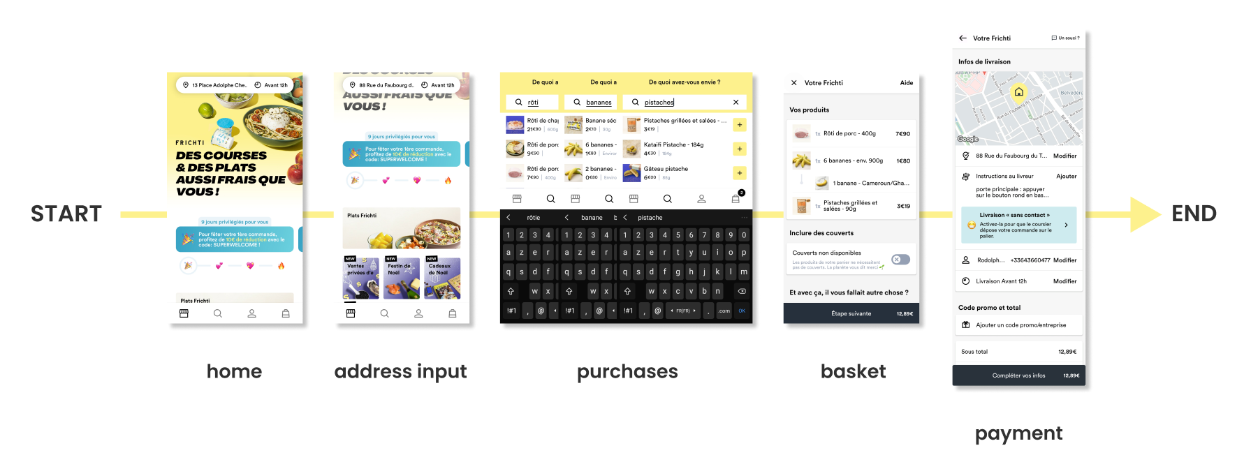
Each test user had the same task : starting from the app's home page, find three items, add them to their basket, and get them delivered to their place.

User flow on the Frichti app as we envisioned it

Friction points

Overall, testers had mixed feelings after completing the process. Only one followed the expected user flow, while the others had to refill their basket after forgetting to enter their delivery address at the start.

Four main issues emerged from our tests:

  1. Users overlook the address field on the home page.
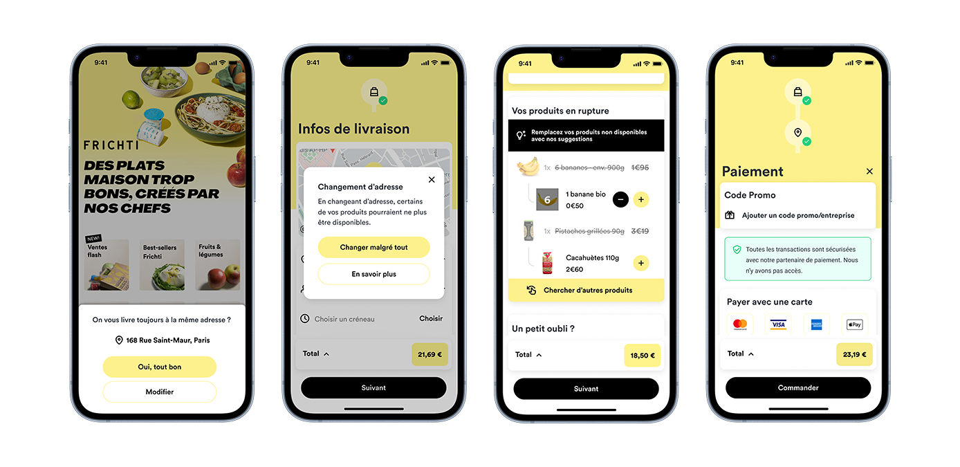
  2. Users don't read the pop-up when changing their address during checkout.
  3. Users are frustated to start their whole shopping over.
  4. Users find the payment screen overwhelming, with too much information

*If no address is entered on the home page, Frichti uses geolocation to assign the closest kitchen to the user while browsing. Since each kitchen has a different product selection, changing the address at checkout reassigns the user to a new kitchen—automatically emptying the basket and forcing them to start over.

Real user flow on the Frichti app

Smoothing the user experience

By exploring design patterns from other applications, we were able to identify how similar issues were addressed. We shared our findings and ideas through a mind map and developed tailored solutions for each of the friction points discovered during the tests.

  1. Add an overlay highlighting the user's current address and asking for confirmation to continue.
  2. Make the pop-up more attention-grabbing and include a “Learn More” button to explain Frichti's kitchen mechanic, helping reduce user frustration.
  3. Replace products that are also available in the new kitchen and offer suggestions for products that aren't.
  4. Split the payment screens to reduce information overload.
Frichti check out overhaul

Testing and Validation

With our proposed solutions in place, the next step was to validate their effectiveness. To do this, we conducted A/B testing, creating two different design variations for each solution and presenting them to testers. Each participant was asked to complete a checkout process while interacting with one of the two versions.

This approach allowed us to gather direct feedbacks on each design. We closely observed user behavior, focusing on key factors such as whether they noticed and interacted with the address confirmation overlay, how they responded to the redesigned pop-up, and whether the changes in product availability were clear and intuitive.

During tests, the added overlay successfully prevented users from proceeding with the wrong delivery address. Therefore to test the new product suggestion mechanic, we asked testers to go back to the final checkout page and change their address. This allowed us to assess whether the updated system — replacing unavailable products by suggesting alternatives — was intuitive and reduced frustration.

Conclusion

Through careful research, iterative design, and A/B testing, we transformed Frichti's checkout experience into a smoother and more intuitive process. By addressing key friction points we significantly reduced checkout drop-offs and improved overall user satisfaction.