Color palette
Colors are chosen to reflect both RCP's ecological commitments and its financial nature. Each color comes with a range of hue to accomodate UI components.
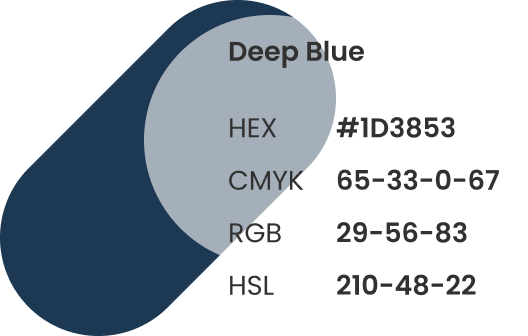
- Blue is traditionnaly used by financial firms but it is also evocative of nature. With Deep Blue we want the user to feel calm, balance and trust
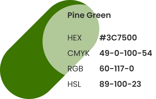
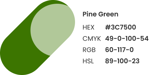
- Green is universally associated with ecology and nature. Pine Green takes a dark shade to complement with Deep Blue.
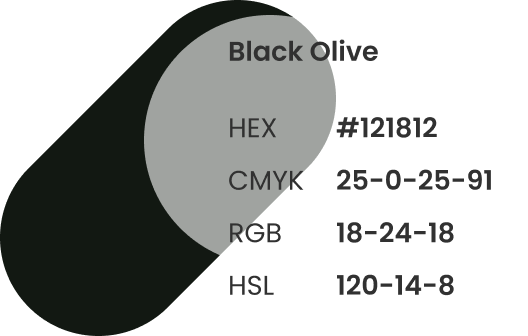
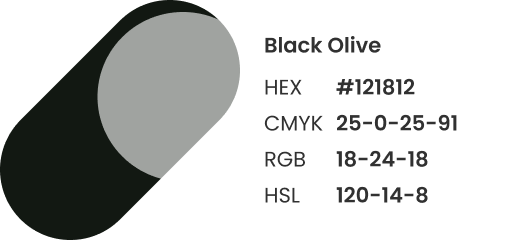
- Black Olive is a dark black with a pinch of green. It is used for the texts.