Skapa
Skapa is a micro entreprise specialized in Adapted Physical Activity (APA) a branch of sport & human movement sciences, which is directed toward people with impairments or activity limitations. Our goal is to design and implement a website from scratch for Skapa to showcase their services to potential new patients.
SKAPA approached me to create a website that would connect him with individuals seeking personalized fitness and well-being solutions. As he had a small budget, it was important that the website was kept simple and clearly showcased his business while being adapted to his audience unique needs and challenges.
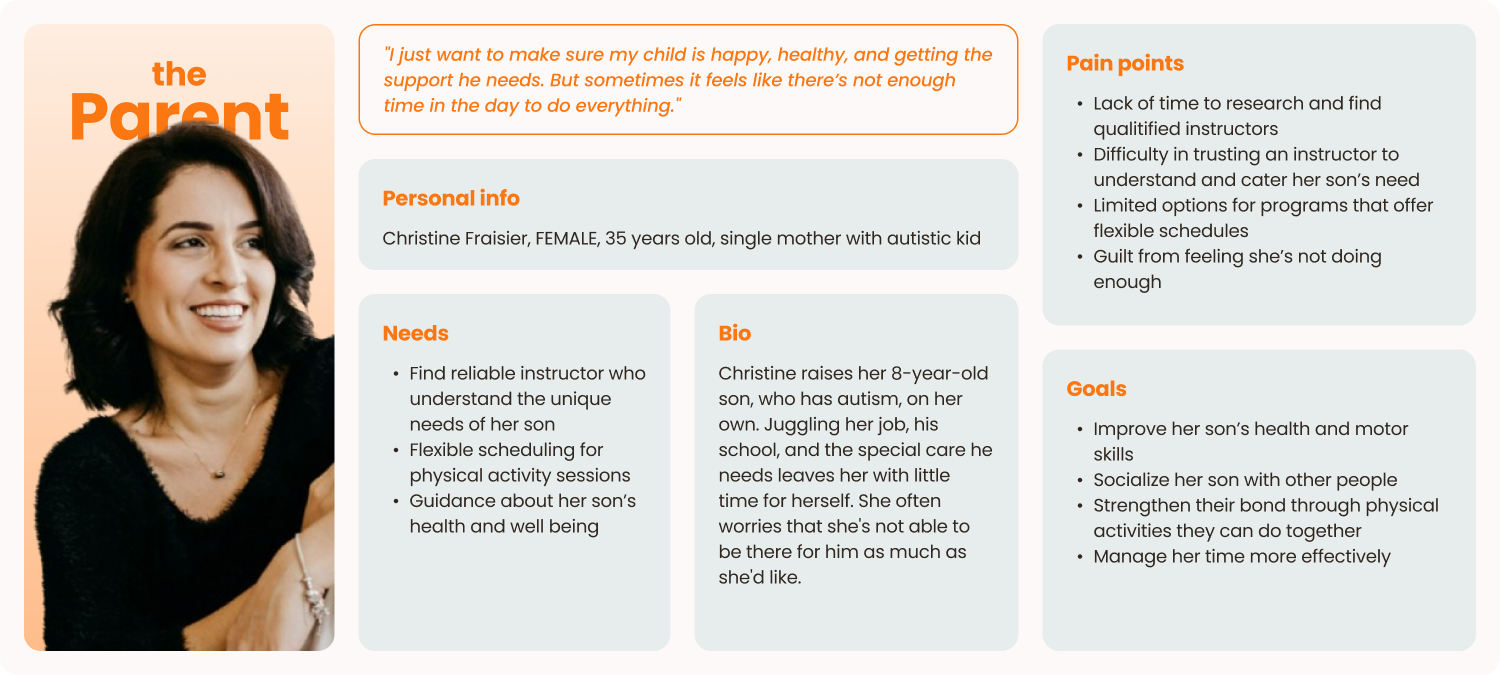
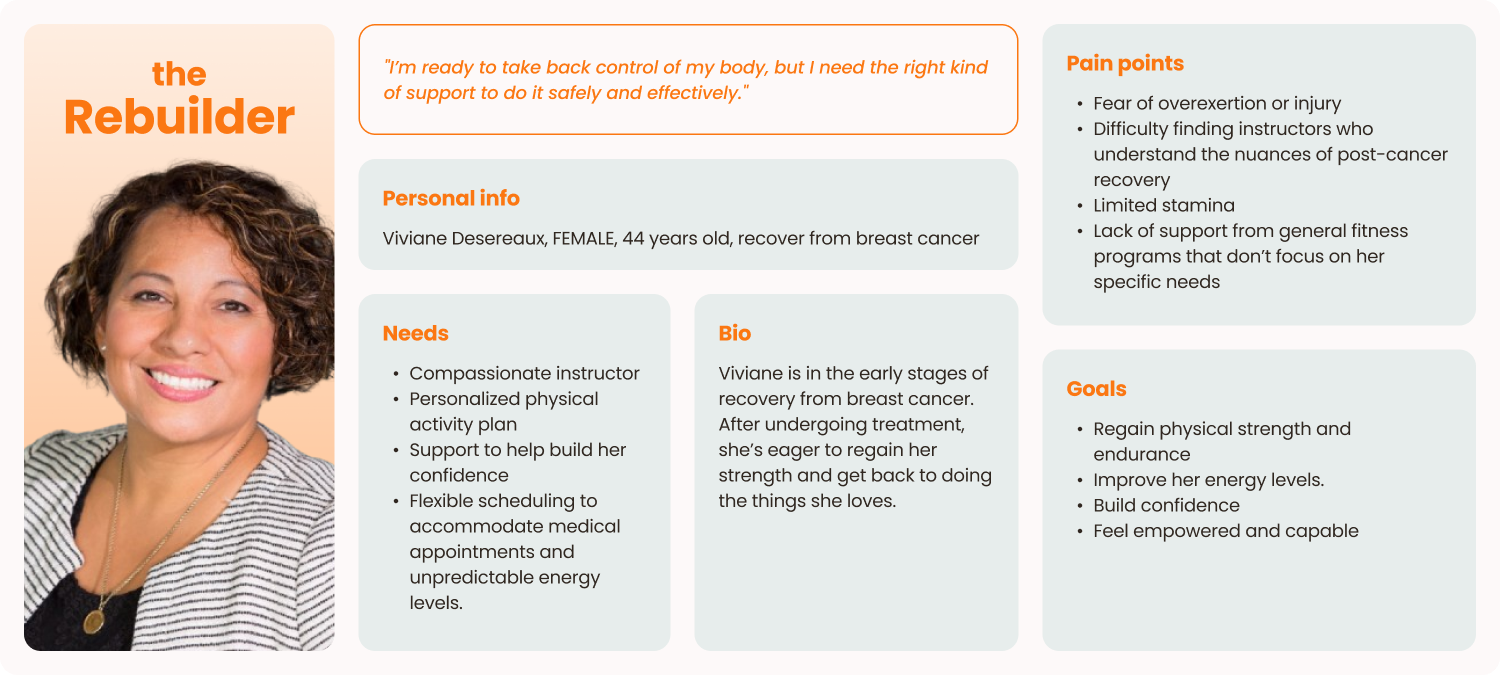
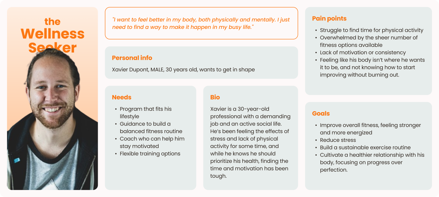
To create a website that truly resonates with SKAPA's clients, I first needed to understand who they were. I started by interviewing Sacha, the founder, to gain insight into his target audience, and the challenges they face when looking for a physical activity instructor. Through this conversation, three personas emerged — the Parent, the Wellness Seeker, and the Rebuilder — each representing a different set of needs, goals, and pain points.
From these personas we identified four friction points :
With these friction points in mind, the goal was to design a website that directly addressed users' struggles and provided a seamless, reassuring experience. This translated into four key objectives:
To ensure a seamless user experience, the website follows a straightforward structure with four main pages. This simple navigation makes it easy for users to find the information they need without friction.
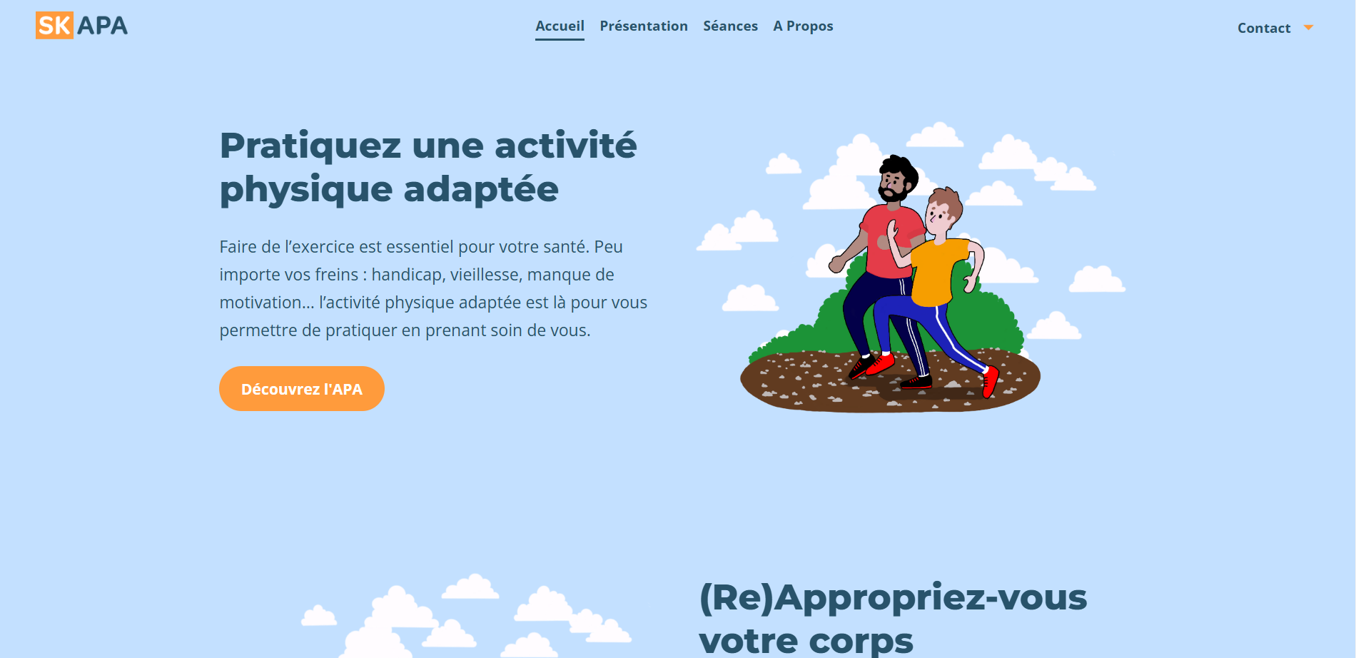
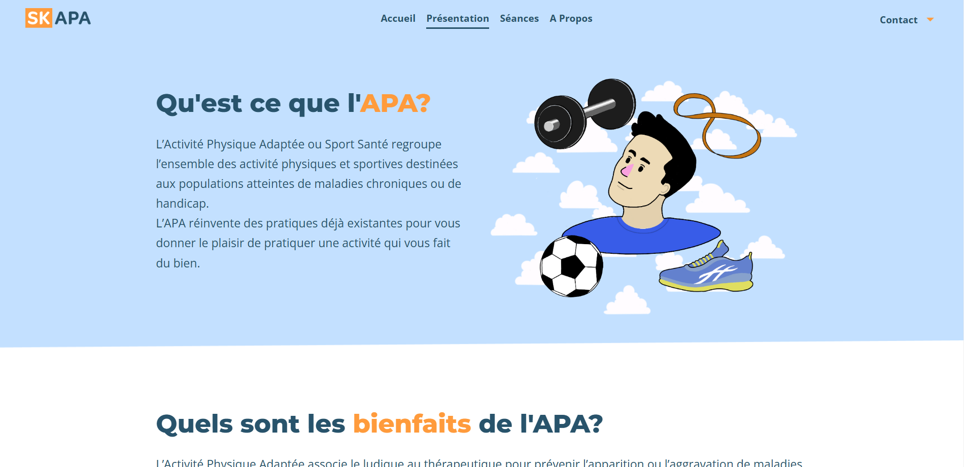
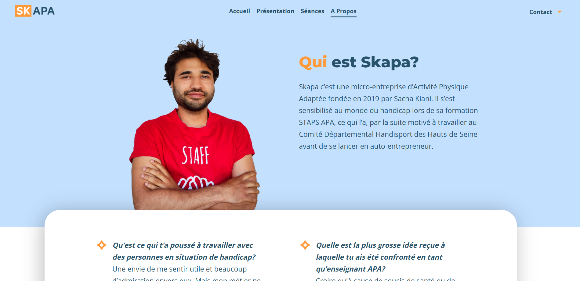
To keep the website approachable and engaging, we adopted a clear and friendly tone with straightforward wording. We made hand-drawn illustrations of people practicing APA together, using bright, calming colors, to reinforce a sense of peacefulness and inclusivity. While the interview with Sacha adds authenticity, allowing users to connect with his motivations and expertise while also addressing common APA-related questions.
Navigation is designed to be intuitive, ensuring users can access key information quickly : A sticky header keeps the menu accessible at all times, allowing seamless navigation between pages. A "Contact" button is always visible, linking to a simple contact section displaying a phone number and email. Since SKAPA prioritizes a human-first approach, we avoided automated forms, ensuring the first point of contact feels personal and direct.
More than just an online presence, the SKAPA website serves as a bridge between Sacha and the people looking for personalized physical activity guidance. It provides clarity, reassurance, and accessibility—allowing users to confidently take the first step toward improving their well-being.